>> now viewing [ Razer Blade 15 ] <<
download resume -->
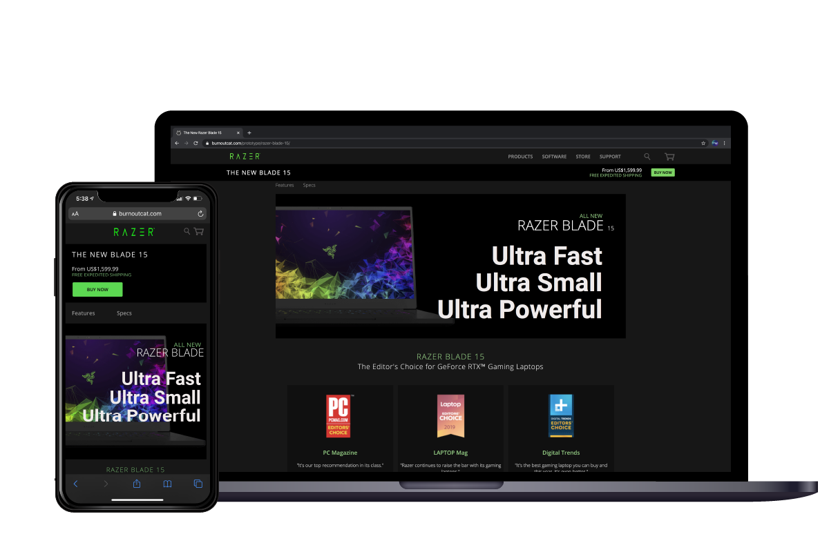
This site is designed for different size screens, and its layout is fine-tuned for mobile, tablet, and computer users. For example, in the mobile version, the “Buy Now” button becomes larger and higher in visual hierarchy, and the fixed header becomes scrollable as it took too much screen real estate for mobile devices.

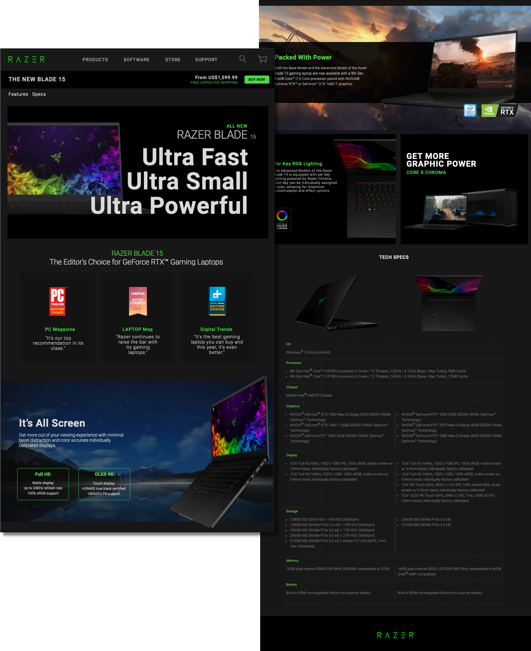
During my web building process, I always start with a prototype before moving to the text editor. In this project, I created a high-fidelity prototype (as shown on the right) and then moved on to coding Html/CSS, eventually build an exact looking website as my prototype.
